The data for each protein link are all presented in the same manner. The information displayed from the top to the bottom of the page can be divided into:
Each of these parts is described in detail below.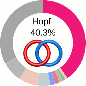
On the top of the page, the pdb code (the first 4 characters) with a chain annotation (the following capital letters) and the title of the RCSB structure are printed along with the image of the protein. Below, four tabs are visible, as shown in Fig. 1. The view displayed by default is the Links data tab. The Chain information summary tab contains information about the chain length, pfam and cath annotations, references to rcsb, and describing articles (if available) with their DOI and PubMed links. In the following tabs, Similar chains (by sequence) and Similar chain (by structure) a user can find structures similar sequentially (up to 40% of sequential similarity) and structurally (using cath annotations).
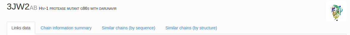
Fig. 1 The protein PDB code (four characters in black) with selected chains (the following alphanumeric symbols) and assigned name based on RCSB website. The four tabs allow the user to find details about link type, basic biological information (Chain information summary), sequence and structural data (Similar chains by sequence or by structures, respectively). By default the Links data tab is displayed.
Critical information about the determined link type and its likelihood is presented using five methods:
When using the probabilistic approach (as described in The probabilistic links and [1], and motivated by [2,3]), the database does not only determine the most probable link type, but also the likelihood of forming any possible link. The probability of forming these different links is presented using an interactive pie chart (Fig. 2). Moreover, for each link type observed, corresponding topological and geometrical data are shown on the protein structure and along the sequence. This option allows the user to analyze links of particular interest.
The main part of the default page contains the JSmol presentation of the protein structure (left) and the pie chart (right) representing the likelihood of each link identified (Fig. 2).
By default the most probable link type (show in the center of the pie chart) is also highlighted on the protein structure(s).
The link likelihood pie chart
The center of the plot depends on the position of the cursor. Placing the cursor on some part of the chart changes its content to the schemae of the corresponding link with its likelihood given in percentage. By default, the most probable link is shown in the center of the plot. The structure corresponding to this link topology is shown to the left.
Graphical representation of the protein
The structure is displayed with the spanning surfaces for the closed loops (Fig. 3). The surfaces can be turned on and off selectively, by clicking the "Toggle surface n" button where surface n corresponds to the spanning surface for the chain n. The surfaces are colored in red, blue (for links formed by two rings) or red, blue, and green (for link formed by three rings), with amino acids forming a closed ring highlighted,using the corresponding color, along the sequence below the figures and the table.
The most probable piercings of each surface by other chains (position of amino acid along the chain) are visualized with different color on the surface. Superposition of link type via the minimal surface method on protein structure allows users (especially in case of the probabilistic links) to decide by visual inspection if obtained results have a biological meaning.
A link type can be additionally visualized by buttons:
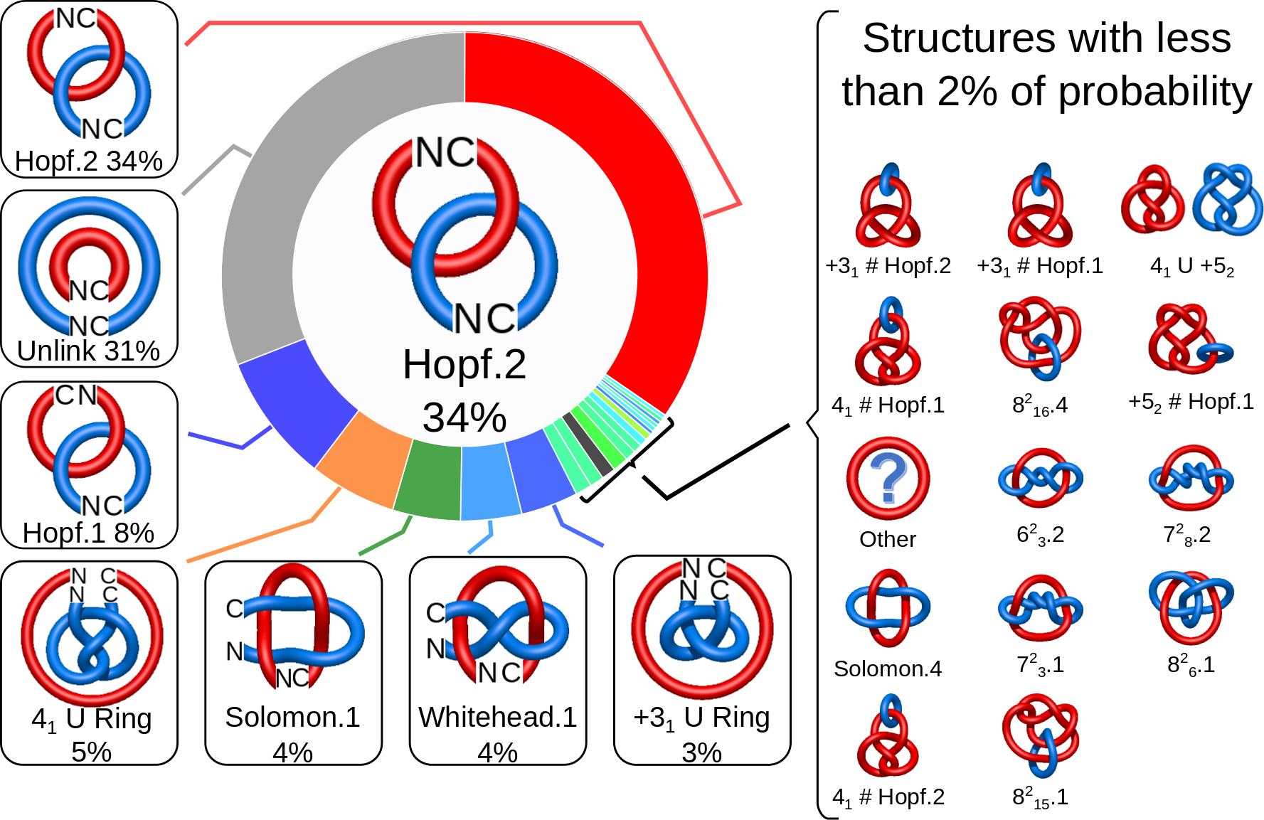
Fig. 2 The pie chart representing the likelihood of the links identified. By default, the most probable link is shown in the center of the plot. Upon placing the cursor over a region of the chart, the corresponding link and its likelihood are displayed in the center of the pie chart. Clicking on a region of the pie chart results in reloading the JSmol content to the left to display the corresponding linking as well as a change in the highlighting of the table below to the corresponding data.
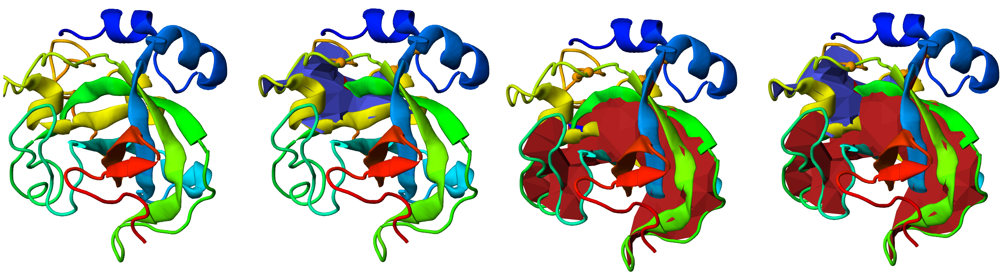
Fig. 3 Visualization of the link type on the protein structure via the minimal spanning surface for the closed loops. The figure shows the JSmol presentations of the same protein with the surfaces selectively turned on and off - from left to right - no surface, blue surface, red surface or both surfaces displayed. The disulfide bonds which the closed protein loops are representaed by the orange edge between orange spheres (the positions of the cysteines).
The representation is equipped with standard JSmol options. The structure is fully rotatable and zoomable, and the user can set their own presentation method (e.g. turning the β-sheet off). Moreover, the JSplot visualization of the structure, with or without surface, can be downloaded as a gif, png or jpg file. More download options are available below the graphical presentation. Upon clicking the Download button, the user can download the pdb files with the presented chains or the vmd and Mathematica files, which allow the user to manipulate the surfaces using these programs (Fig. 4).
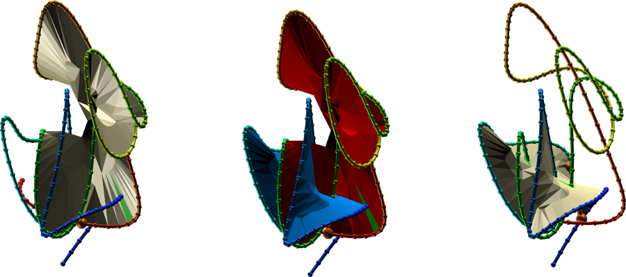
Fig. 4 The protein link structure shown in vmd with and without the surfaces spanned on the covalent loop. For ease of viewing, the chains were smoothed. The "smooth" option is also included in the JSmol presentation, as well as available for download as a vmd script.
For ease of viewing, the main chain of the protein can also be smoothed, while preserving the chain topology, with the smooth button, below the JSmol presentation (Fig. 5). The smoothed presentation of the protein in JSmol preserves its features, i.e. it can be rotated or zoomed as well. The smoothed version of the chain is also available for download as a vmd or Mathematica file.
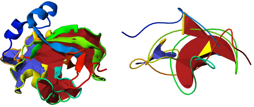
Fig. 5 Comparison between the standard (left panel) and smoothed versions (right panel) of the same protein using JSmol. In the smoothed version, the link formed by the green and yellow parts of the chain is more visible.
The content of the JSmol presentation and the files available to download are dependent on the pie chart. Clicking on the part of the chart corresponding to a different link topology will result in reloading the JSmol content, as well as the downloadable files. This enables the user to download (e.g. smoothed) structures of the protein with different chain closures and compare them, e.g. using the vmd software.
The topological and structural details about the most probable links are stored in the table below the graphical presentation (Fig.6). Each row of the table corresponds to one link. The rows are sorted with decreasing likelihood of the link topology. In each row, one can find the minature depiction of the link identified along with its name and likelihood. The rest of the table presents the piercings through the surfaces. If the link is a two-component link, two surfaces can be spanned (on each component) and therefore two columns containing piercings will be displayed in the table. For three-component links, three columns will be displayed. The piercings are equipped with the direction and the chain name. Some of the piercings can be performed by a piece of the chain, which extends towards infinity. This are artificial piercings with no biological meaning. However, since they are visible in the JSmol presentation and are necessary for double-checking the protein topology, they are maintained in the table. To distinguish them from other piercings, these piercings are displayed in orange. In general, the piercings depend on the chain closure. The table presents the piercings visible in the JSmol presentation. The JSmol presentation, on the other hand, presents the structure with the most representative (most common) piercings. The more detailed information about the distribution of piercings is displayed in the sequence and in the piercing histograms on the bottom of the page.
The "View details" button is located in the left-most part of the table. Clicking on this button has the same effect as clicking on the corresponding part of the pie chart - it reloads the JSmol representation, adjusting to the link choosen. The currently displayed link topology is indicated with symbol.
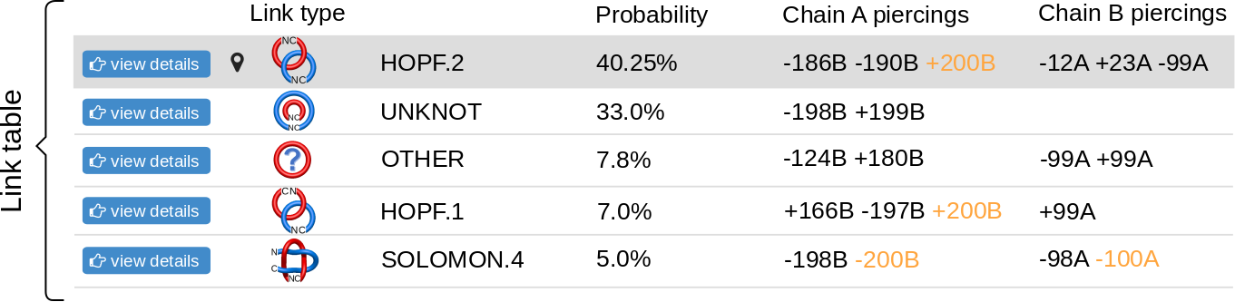
Fig. 6 An example of the table showing the observed links. The table contains the link types and the piercings through the spanning surfaces of each component.
Below the table with detailed information about topology and the most common piercings, the sequences of all link-forming chains are displayed. The sequences have the additional feature of showing the distribution and probability of piercings. The most common piercings are highlighted (e.g. amino acids T, L, and F in Chain A, Fig. 7). These are the piercings in JSmol representation, as well as in the table above. The other piercings are also highlighted. The intensity of the color denotes the frequency, i.e. how many times (out of all the chain closing attempts that resulted in the chosen topology) that particular residue was the piercing one. The residues piercing the surface from the different sides (positive or negative piercings) are highlighted in different colors, e.g. negative are magenta and cyan, positive are red and blue, respectively. Note, that sometimes piercings are formed by the chain closure, and since the chain closure has no natural residue it is not displayed in the sequence, although it is displayed in the table (the orange entries).

Fig. 7 An example of the sequence corresponding to the Hopf link row in Fig. 6. The highlighted residues are the piercing residues in some closures, with the intensity of the color denoting the probability that a particular residue is the piercing residue. The residues with black borders are usually the most common and are the piercing residues visible in JSmol representation, as well as in the table above. Residues piercing the surface from different sides (positive or negative piercings) are shown in different colors: negative are magenta and cyan, positive are red and blue, respectively.
The chain sequences contain information about the piercing probabilities, coded by the intensity of the highlighting color. The exact information about the number of times a given residue is the piercing residue is shown in the histograms on the bottom of the page (Fig. 8). The histograms show the number of closures in which the residue with index i is the piercing residue. LinkProt distinguishes between positive and negative piercings, similar to how it handles sequences. The histograms provide additional information about the protein geometry - it shows the exact piercing fragment. If the piercing fragment is focused on a small number of residues, it follows that the local link geometry is independent of the closure, which means that it can be more relevant biologically.
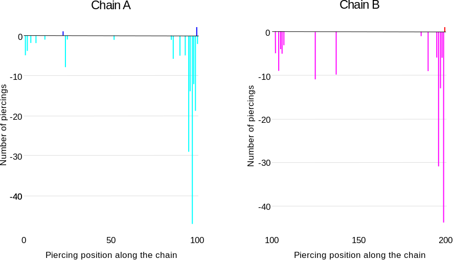
Fig. 8 An example of the histograms for row of the table from Fig. 6 and the sequence from Fig. 7. The histograms show that the link-forming piercings are located close to the C-terminus of both chains. Additionally, in some closures, additional piercings close to the N-terminus of the chain are possible.
